Say It With Charts
In the September 2009 issue of the Harvard Business Review, Paul Hemp rants about Death by Information Overload. Too much information flooding our email, internet searches, business reports, cable news, etc.
What's the cure for information overload? A well drawn chart!
One of the ongoing questions we receive from QI Macros users is: "What Chart Should I Choose?"
My friend Dave used to say: "Everything you want to know is written down in a book somewhere. All you have to do is find an author that speaks to you." One of our users recommended a book, Say It With Charts, by Gene Zelazny, Director of Visual Communications for McKinsey & Co. He spent 30 years helping McKinsey make sense of the plethora of data in companies. What I admire about this book is its simplicity.
Say It With Charts
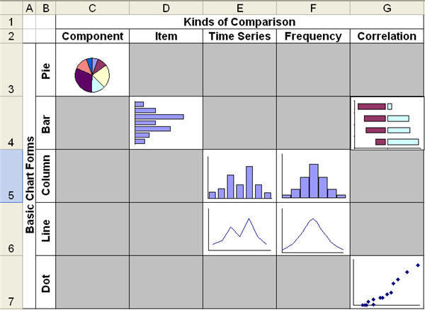
Zelasny found that there are five styles and categories of charts:
- Pie Charts - to show the size of components of the total as a percentage
- Bar Charts - to show the rank of various items (e.g., Pareto Chart)
- Column Charts - to show frequency of occurrence (i.e., histograms)
- Line (i.e., run or control) Charts - to show time series (i.e., how they change over time)
- Scatter and Tornado Charts - to show correlation (i.e., the relationship between two variables)
That's it!
Process
Zelasny recommends a three step process for choosing a chart:
- Message:What story are you trying to tell? It will shape the choice of chart.
- Comparison: Humans learn by contrast. What are you trying to compare?
- Chart Selection: Which chart best delivers your message and comparison?
Simplify, Simplify, Simplify
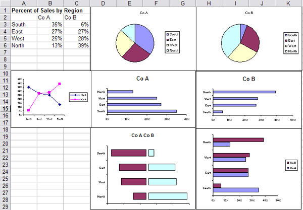
Zelasny suggests that instead of trying to put everything onto one chart, that we make several charts with a limited amount of data.
My favorite? Comparing your business to various competitors. If you put your business and all competitors on one chart, it becomes difficult to determine where you stand compared to everyone else.
Split it out onto multiple charts comparing your business to one competitor per chart... and you quickly discover which competitors you need to watch.
Try it Yourself
Download Sample Data (XLS)
Here's My Point
The tsunami of data pouring out of our IT and internet systems threaten to overwhelm all of us. Consolidating that data into a handful of well designed charts can quickly communicate performance trends in ways that no spreadsheet ever will.
Do you need a dashboard? Try QI Macros new XmR, c, np, p, u dashboards.
Do you need to summarize data? Consider using pivot tables.
Other Charts Included in QI Macros for Excel
Join 100,000+ Users
in 80 Countries
![]()
