Creating an Improvement Story in Excel
Case Study - Creating an Improvement Story
Many people look at an Excel spreadsheet of data and have a hard time figuring out how to convert the data into an improvement story. So, I thought I'd share the patterns I'm looking for when I start to analyze data
Step 1: Most Six Sigma improvement stories start with a line, run, or control chart of defect data over time. Look at this data from c:\qimacros\testdata\AIAG SPC.xls (pg. 88 in AIAG SPC 2nd Edition):
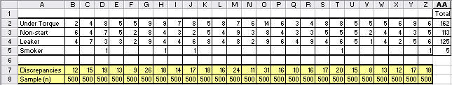
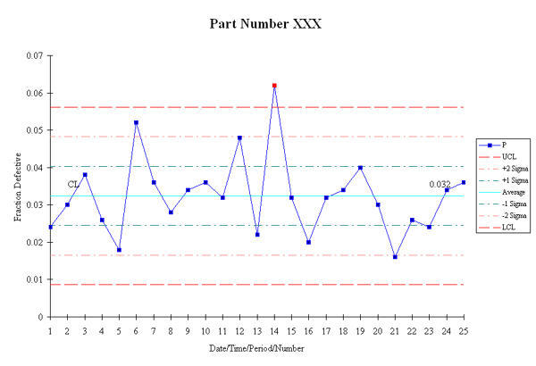
In this example, I immediately see the discrepancies as the variable I want to graph. Each 500 sample group has an implied time element to it. So I'd grab this data and run a np chart, because it's as easy to run a control chart as a line or run chart and it gives you more information:
The next thing to do is to look for ways to stratify the data to find a pareto pattern. Now I look at the data in a different way. I look for categories to graph as a pareto chart.
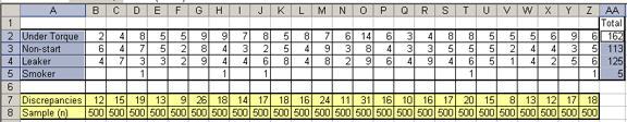
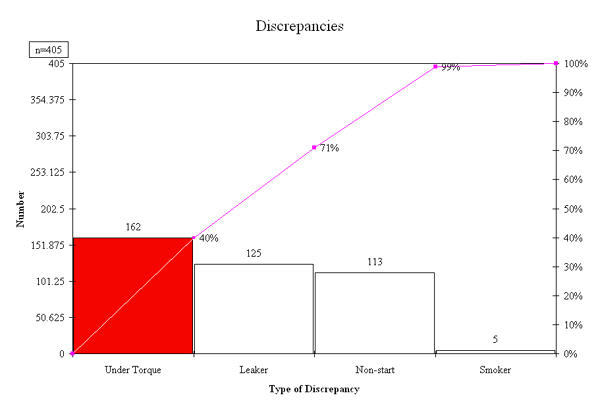
To run a chart for data that is not in adjacent columns, select the first set of data (cells A2 to A5) then hold the ctrl key down and select the second set of data (AA2 to AA5). This gives the following pareto chart:
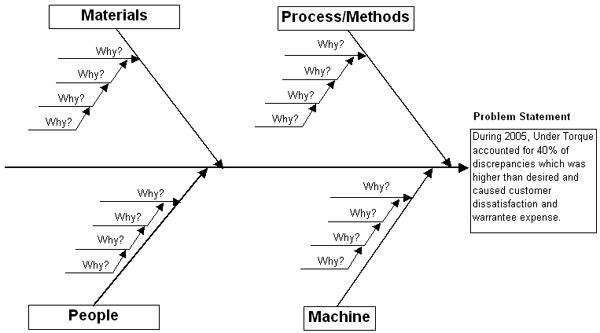
Given this, I can use the template selector to start creating fishbone diagrams of the top three categories:
Quick and easy, isn't it?
Other Charts Included in QI Macros for Excel
Join 100,000+ Users
in 80 Countries
![]()
