Tips on Formatting Data Before You Run a Chart
Formatting and Selecting Your Data Correctly
We have tried to foolproof QI Macros, but we have to make certain assumptions about the data you select before running a chart. One assumption is that you have no more than one row of headings and one column of labels. If you have two rows of headings or two columns of labels BE CAREFUL. Selecting the extra columns or rows will create problems with your calculations and with your chart.
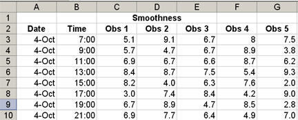
The example below has two rows of headings. Row 1 "Smoothness" and Row 2 : date, time, Obs 1, etc. It also has two labels. Column A for date and column B for time.
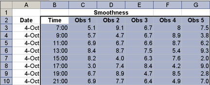
The Problem with Selecting Two Rows
If you select the two heading rows like this:
You will get a chart that looks like this:
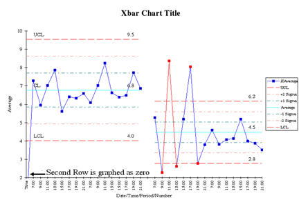
Notice that the first point graphed on the chart is zero. This is because the macro interprets the second heading row as data and gives it a value of zero. This also makes the average and sigma line calculations incorrect.
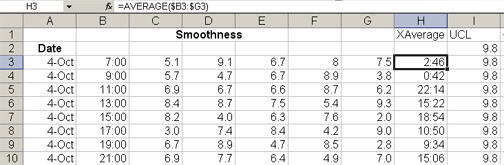
The Problem with Selecting Two Columns
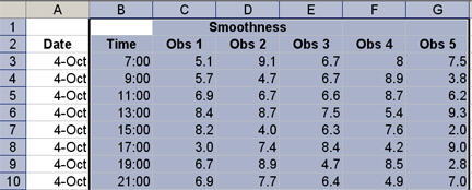
If you select two columns of labels like this:
Your chart may look okay, but if you look in the chart data sheet where the calculations are performed, you will notice that column B is included in the calculations. In the example below, cell H3 which calculates the average of the data points is including the time label in column B as part of its calculations. A value of 7 is being added to the values of 5.1, 9.1 etc. to calculate the average in column H.
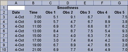
Foolproof your charts by formatting your data with only one descriptive row and column.
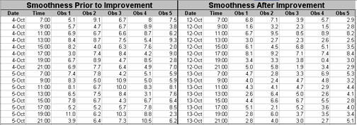
Case Study Smoothness of Gel Caps from Quality Magazine Brain Teaser
The following case study uses Dr. Sophronia Ward's Brain Teaser column in the December 2005 issue of Quality Magazine.
Background
After a recent improvement in the surface smoothness of gel capsules, a process engineer received complaints from a customer that the capsules were sticking to the chutes on the production line. After ruling out the machine as the cause, the team looked into the surface smoothness of the gel caps.
Download the data for this example (XLS)
Case Study Question 1
Is there evidence in the data that the recent efforts to improve the gel cap smoothness did result in a change to the surface smoothness?
To determine this, we will want to run a control chart on data before and after the process change. The data in Dr. Ward's example looks like this:
Reformat the Data Before You Run the Chart
The data table provided by Dr Ward shows the "before" and "after" data side by side. In order, to run a control chart using QI Macros we need to move the "after" data below the "before" data. Select the data and then select Edit/Cut, next click on the cell below the before data and select Edit/Paste.
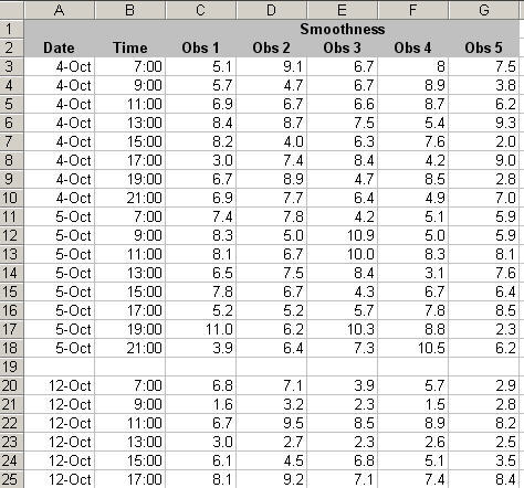
Using a Blank Row to Show Before and After a Process Change
Finally, insert a blank row between the Oct. 5 data and the Oct. 12 data to take advantage of QI Macros ability to calculate different sets of control limits for the before and after data. Your data should look like this.
Selecting Your Data for the XbarR Chart
Since we have 5 samples or observations for each date and time we will select the XbarR chart. The XbarR chart will calculate an average for the 5 points for each date and time and graph these averages. The XbarR chart is sometimes referred to as the average and range chart. Using the rules discussed above we will only select one descriptive row and column when we select the data to run a chart. Our selection looks like this:
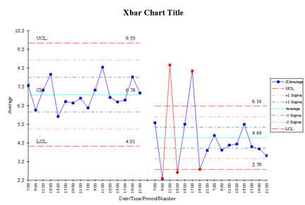
The X chart looks like this:
The Range chart looks like this.
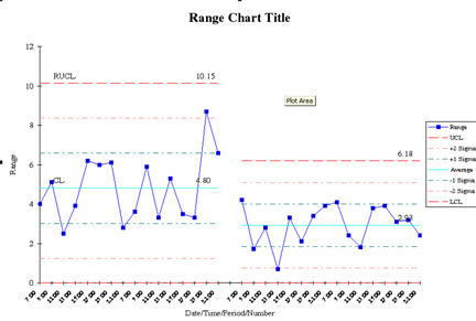
Response to Question 1: The before and after charts show a very unstable process right after the process change and then a definite decrease in surface smoothness. The range chart shows that the variation in surface smoothness has decreased as well.
Case Study Question 2: Is there evidence in the data to indicate that the new gel caps are too smooth?
Response to Question 2: The smoothness has definitely changed, but it would require more analysis to determine if they are too smooth.
Case Study Question 3: How can the process engineer determine the optimal surface smoothness?
Response to Question 3: They would need to run a designed experiment.
Here's the Point
QI Macros are smart but they are not foolproof. Remember this rule when you select your data. Only select one row and one column of headings or labels.
If you are looking for manufacturing case studies, a great resource is Dr. Sophronia Ward's Brain Teaser column in Quality Magazine. You can view back issues on the Quality Magazine website.
If you need help analyzing your data, we offer data analysis services via email. Just send us your data and a brief explanation of your process and suspected problem. We will send you a quote to analyze your data and create an actionable improvement project to focus on the 4% of your process that causes 50% of the lost profit. Email your data to knowwareman@qimacros.com.
Other Charts Included in QI Macros for Excel
Join 100,000+ Users
in 80 Countries
![]()
